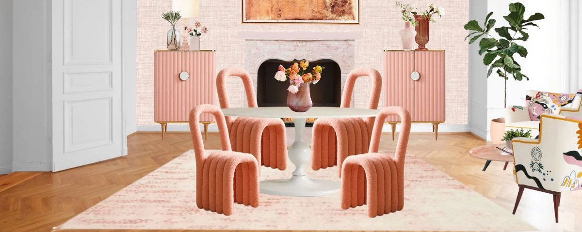


While the color pink often reminds people of femininity and girly things, it can symbolize many different things. From millennial pink and bubblegum pink to Barbie pink (we're looking at you, Barbiecore design) and darker shades of rose, hundreds of shades of the color span across the color spectrum.
If you're interested in learning more about the color pink and want to learn how you can use it in your designs, keep on reading for some design tips.


If you're looking for pink on a traditional color wheel, you might be surprised not to find it there because pink is a tint of red! Modern color wheels tend to feature pink alongside other colors, such as red and lilac.
Because pink is a tint of red, you need to blend white and red together to achieve any shade of pink. Similarly, to alter the color pink, you can mix other colors, such as brown, yellow, or purple, to achieve various shades of the color.
According to a study in SAGE Journals, how we feel about certain colors is often due to cultural influencers and past experiences. Different shades of pink can portray different feelings, but generally speaking, the color pink represents romance, femininity, innocence, healing, tranquility, and playfulness.
Because the color pink tends to exude positive feelings, it makes it a great color contender when creating a color palette while designing your home. Living rooms, bathrooms, kitchens, and even front doors, would make a perfect canvas for adding a touch of pink whimsy to your space.
Pink doesn’t just belong in places like nurseries or kid’s rooms, which is what the color is often associated with. Scroll through for some tips for decorating with pink and some of our favorite uses of pink in interior design.
If you are not ready to commit to an entirely pink painted room, try using pops of pink with painted furniture or accent walls.
Pink pairs nicely with analogous warm colors like orange. These two colors together make a bold statement. Pink and red is another punchy pairing
Green is another excellent color to pair pink with. Green is opposite of red on the color wheel, so pairing pink with green can add visual balance to a space. Darker shades of pink with green can read a bit too Christmasy, so consider using lighter shades of pink like blush instead.
For a more luxurious feel, blend softer shades of pink with deeper colors like navy blue and burgundy.

While the color pink often reminds people of femininity and girly things, it can symbolize many different things. From millennial pink and bubblegum pink to Barbie pink (we're looking at you, Barbiecore design) and darker shades of rose, hundreds of shades of the color span across the color spectrum.
If you're interested in learning more about the color pink and want to learn how you can use it in your designs, keep on reading for some design tips.

If you're looking for pink on a traditional color wheel, you might be surprised not to find it there because pink is a tint of red! Modern color wheels tend to feature pink alongside other colors, such as red and lilac.
Because pink is a tint of red, you need to blend white and red together to achieve any shade of pink. Similarly, to alter the color pink, you can mix other colors, such as brown, yellow, or purple, to achieve various shades of the color.
According to a study in SAGE Journals, how we feel about certain colors is often due to cultural influencers and past experiences. Different shades of pink can portray different feelings, but generally speaking, the color pink represents romance, femininity, innocence, healing, tranquility, and playfulness.
Because the color pink tends to exude positive feelings, it makes it a great color contender when creating a color palette while designing your home. Living rooms, bathrooms, kitchens, and even front doors, would make a perfect canvas for adding a touch of pink whimsy to your space.
Pink doesn’t just belong in places like nurseries or kid’s rooms, which is what the color is often associated with. Scroll through for some tips for decorating with pink and some of our favorite uses of pink in interior design.
If you are not ready to commit to an entirely pink painted room, try using pops of pink with painted furniture or accent walls.
Pink pairs nicely with analogous warm colors like orange. These two colors together make a bold statement. Pink and red is another punchy pairing
Green is another excellent color to pair pink with. Green is opposite of red on the color wheel, so pairing pink with green can add visual balance to a space. Darker shades of pink with green can read a bit too Christmasy, so consider using lighter shades of pink like blush instead.
For a more luxurious feel, blend softer shades of pink with deeper colors like navy blue and burgundy.

We are an online interior design studio for enthusiasts and professionals. Get a real-world design education, easy-to-use tools, job opportunities, and a tight-knit community. All levels welcome.
Join now